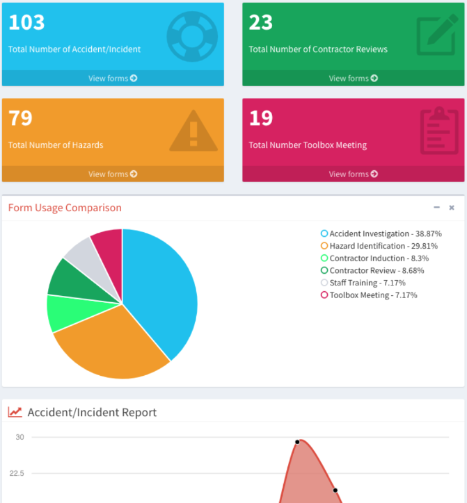
User level accounts for each organisation will have quick access to key information. The User can see the total number of each form created by the User. A pie chart of the forms distribution is shown below. Users are also able to view an Accident/Incident Report graph reported by themselves where accidents and incidents are sorted on a monthly basis. The previous year’s Accident/Incident Report timeline is shown in red for caomparative purposes. This graph will give a good indication if there are trending patterns during specific times of the year.